Form Accessibility - Try Out Your Own
With web standards being all the rage, and accessibility being a major driving factor in people adopting standards, you might be surprised to actually check out the accessibility of web-sites. After watching a video of a blind user using Jaws, I figured to give using a screen reader a try just to see if I could understand it any better. I ran into a couple problematic areas; what caught my attention first was the use of forms.
When Things Were Right
When a form was built properly, I could easily understand what inputs a form had, and what input I had tabbed to. Quite simply, there were 2 tags the specifically improved the accessibility of the form for my screen reader: legend and label .
<fieldset>

<legend>Personal</legend> ...</fieldset>
When I tabbed to an input that was within a fieldset , and that fieldset had a legend , it would tell me. The above would read to me: “Personal grouping.” So if this fieldset wrapped up inputs like your name, telephone, and e-mail address, it would remind me each time that this input was part of the “Personal grouping”, so I knew I hadn’t tabbed to a new fieldset . Good.
<label> <input name="personal:name" type="text" /> <span>Name</span></label>
For specific inputs, having a label did exactly as we would hope. I tabbed to the input , and it read the label and input type: “Name, text.” It specifically worked with the above example, when the input was inside a label . It would read the rest of the text inside the label .
When Things Sucked
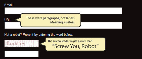
I visited a few other sites that seemed to be using standards, and found that their forms performed far worse. It showed that using the correct structure for forms is actually very important . When a form used a simple paragraph before an input, with no label , guess what happened? Yep, it skipped it. When I tabbed to an input , it would just read me: “Text”. Hey, great. Any text? You got it: poop.
Yea, not good.
Even worse
Even if someone managed to make up information for these fields, or perhaps, say they did have labels on them, one more form feature that screwed my experience using a screen reader: captcha. Some implementations simply had an image above the input, with no alt tag, no possible way for me to ever prove I’m a human being. Minus one call to action.

Try Out Your Own
I’d suggest grabbing NVDA, and surfing your site, and pay attention to your forms. See if the way you made them makes sense to a screen reader. And then visit some of your favorite sites, try out their forms, and compare with their markup. It’s quite enlightening.