Saftey Cap: Slide to Delete
Yesterday Jeff Atwood wrote about Fitts’ law and the contrapositive in regards to big, bad eject buttons. The point of his piece was that you shouldn’t have buttons with irreversibledestructiveresults be right next to buttons with more frequent use.
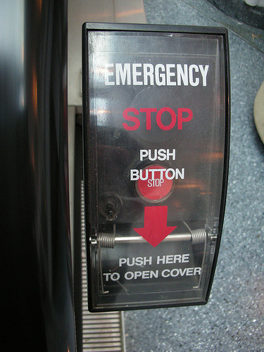
I was actually more intrigued by a couple of the commentors when they mentioned a real life example of excellent “eject” button UI: these incredibly important buttons have a safety cap over them.
Put a safety cap over the button. You know, like in the movies :-) You cannot press the button, because there is a “cap” on top of it. You first have to “open the cap” before you can press the button below it. In case of software, the button would be not directly visible, you first have to press somewhere to make the button appear and then you can press it
Yea, that. There’s no way you can accidentally push that button. (Wouldn’t it be nice if that were true?)
I’ve seen this idea before, I’m sure, but wanted to throw it together anyways. When you click the delete button, or any other important, damaging button, the delete button disappears and a slider appears, requiring you to move the slider over to complete the delete action. This only took a few minutes, so I wouldn’t necessary use this code for production. Regardless, here’s a proof of concept: (if you’re in a reader, you should come through to the site to see this).
